body {
width: 100%;
min-width: 100%;
position: relative;
top: 0;
left: 0;
right: 0;
margin: 0;
padding: 0;
}
.marginFix {
position: relative;
top: 0;
left: 0;
right: 0;
}
.full-width-container {
width: 100% !important;
min-width: 320px !important;
}
.full-width-container-inner {
width: 100% !important;
min-width: 100% !important;
padding: 0px 0px 0px 0px !important;
}
.hide {
width: 0px !important;
height: 0px !important;
display: none !important;
}
.full-width {
width: 100% !important;
min-width: 100% !important;
}
.stackTbl {
width: 100% !important;
display: table !important;
}
.stackTblMarginTop {
width: 100% !important;
display: table !important;
margin-top: 2px !important;
}
.stackTblMarginTop2 {
width: 100% !important;
display: table !important;
margin-top: 20px !important;
}
.stackTblMarginTop3 {
width: 100% !important;
display: table !important;
margin-top: 40px !important;
padding-top: 40px !important;
border-top: 2px solid #F5F5F5;
}
.center {
margin: 0px auto !important;
}
.floatLeft {
float: left !important;
width: 35% !important;
}
.alignLeft {
float: left !important;
}
.floatRight {
float: right !important;
width: 60% !important;
}
.autoHeight {
height: auto !important;
}
.leftText {
text-align: left !important;
}
/*** Padding Styles ***/
.mobilePadding {
padding: 30px 20px 50px 20px !important
}
.mobilePadding1 {
padding: 20px 20px 40px 20px !important;
height: auto !important;
}
.mobilePadding2 {
padding: 30px 20px 30px 20px !important;
}
.mobilePadding3 {
padding: 20px 20px 0px 20px !important
}
.mobilePadding4 {
padding: 40px 20px 40px 20px !important;
}
.mobilePadding5 {
padding: 25px 20px 25px 20px !important;
}
.mobileSidePadding {
padding-left: 20px !important;
padding-right: 20px !important;
}
.mobileSidePadding2 {
padding-left: 25px !important;
padding-right: 25px !important;
}
.padding0 {
padding: 0px !important
}
.topPadding0 {
padding-top: 0px !important
}
.topPadding10 {
padding-top: 10px !important;
}
.topPadding20 {
padding-top: 20px !important;
}
.topPadding40 {
padding-top: 40px !important;
}
.bottomPadding0 {
padding-bottom: 0px !important
}
.bottomPadding10 {
padding-bottom: 10px !important;
}
.bottomPadding20 {
padding-bottom: 20px !important;
}
.bottomPadding40 {
padding-bottom: 40px !important;
}
.rightPadding10 {
padding-right: 10px !important;
}
.leftPadding0 {
padding-left: 0px !important;
}
.bottomPadding160 {
padding-bottom: 160px !important;
}
/*** Text/Divider/Image Styles ***/
.noBackground {
background: none !important;
background-color: #ffffff !important;
height: auto !important;
}
.divider {
height: 2px !important;
}
.fullWidthImg {
width: 100% !important;
height: auto !important;
min-width: 100% !important;
}
/* background image resize scalable height */
.imgReplaceLeft {
background-image: url("images/hero-sector-educativo.jpg") !important;
width: 100% !important;
height: auto !important;
/* update height here */
background-size: cover !important;
background-position: left top !important;
background-repeat: no-repeat !important;
display: block !important;
}
/*** 3 Across Styling ***/
.threeAcrossWidth {
width: 30% !important;
}
.threeWideResize {
/* 3-across section resize */
width: 100% !important;
height: auto !important;
font-size: 16px !important;
line-height: 19px !important;
padding-bottom: 0px !important;
}
/*** 4 Across Styling ***/
.fourAcrossWidth {
width: 44% !important;
}
/*** navigation ***/
.topnav {
width: 33% !important;
}
.topnav-right {
width: 33% !important;
text-align: right !important;
}
.footernavcaptop {
display: block !important;
width: 100% !important;
text-align: center !important;
border-bottom: 1px solid #C0C0C0 !important;
border-right: none !important;
font-size: 18px !important;
line-height: 21px !important;
padding: 0px 0px 15px 0px !important;
}
.footernav {
display: block !important;
width: 100% !important;
text-align: center !important;
border-bottom: 1px solid #C0C0C0 !important;
border-right: none !important;
font-size: 18px !important;
line-height: 21px !important;
padding: 15px 0px 15px 0px !important;
}
.footernavcapbot {
display: block !important;
width: 100% !important;
text-align: center !important;
font-size: 18px !important;
line-height: 21px !important;
padding: 15px 0px 0px 0px !important;
}
.innernavcaptop {
display: block !important;
width: 100% !important;
text-align: center !important;
padding: 0px 0px 10px 0px !important;
}
.innernav {
display: block !important;
width: 100% !important;
text-align: center !important;
padding: 10px 0px 10px 0px !important;
}
.innernavcapbot {
display: block !important;
width: 100% !important;
padding: 10px 0px 0px 0px !important;
}
.mobileLogo {
width: 120px !important;
}
.ctaPrimary, .ctaSecondary {
width: 100% !important;
}
.featureHead {
padding-top: 15px !important;
}
.featureHead2 {
padding-top: 225px !important;
padding-left: 0px !important;
}
.ctaPrimary2 {
border: 2px solid #2F3132;
}
.ctaPrimary2 a {
border: none !important;
}
.ctaPrimary2:hover a {
color: #2F3132 !important;
}
.ctaPrimary5 {
border: 2px solid #ffffff;
}
.ctaPrimary5 a {
border: none !important;
}
.ctaPrimary5:hover a {
color: #2F3132 !important;
}
.headBlack {
color: #2F3132 !important;
}
.textBlack {
color: #6F7678 !important;
}
.ctaPrimary3 {
border: 2px solid #2F3132;
}
.ctaPrimary3 a {
border: none !important;
color: #2F3132 !important;
}
.ctaPrimary3:hover {
background-color: #DCFD00 !important;
}
.ctaPrimary3:hover a {
color: #2F3132 !important;
}
.centerText {
text-align: center !important;
}
.pbSpace {
height: 2px !important;
}
.partnerLogo {
padding-right: 18px !important;
}
.partnerLogo img, .partnerLogoLast img {
height: 30px !important;
}
}
@media only screen and (max-width: 375px) {
.partnerLogo {
padding-right: 12px !important;
}
.partnerLogo img, .partnerLogoLast img {
height: 25px !important;
}
}
/*** END Responsive CSS ***/
SOLUCIONES DE Conoce 10 aplicaciones del video en el sector
DISTINTAS APLICACIONES DEL VIDEO La educación cambió hace varios meses y todavía hoy muchas instituciones educativas están ajustando sus métodos de enseñanza para adaptarse a un ambiente que estará en constante movimiento entre enseñanza presencial, virtual e híbrida. Logitech facilita el aprendizaje con soluciones para ayudar a estudiantes y docentes en este dinámico mundo educativo de la actualidad. Habilita a los docentes con soluciones Desde cámaras web externas para la colaboración cara-a-cara hasta cámaras de conferencia que permiten a los docentes compartir mucho material en la pantalla, Logitech tiene soluciones USB para ampliar el alcance del aprendizaje más allá de las fronteras del aula.
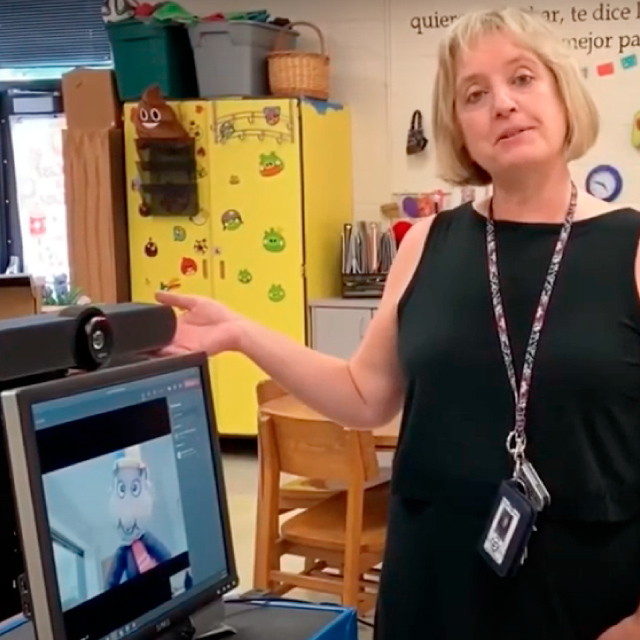
HERRAMIENTAS Mira cómo Allison Maldonado, una profesora de secundaria, prepara su aula con Logitech MeetUp para dar la bienvenida a la educación híbrida.
¿QUIERES CONOCER MÁS SOBRE LAS SOLUCIONES DE VIDEO QUE LOGITECH TIENE PARA LA EDUCACIÓN HÍBRIDA?
CONTÁCTAME HOY
Tecnologías Ligadas a IP S.A. de C.V.